K. Kozeniewski
Monitor

http://feelingoldschool.com/project /index.php
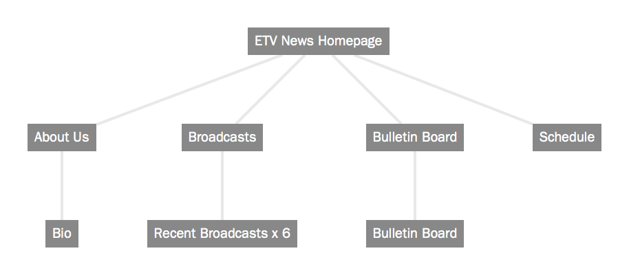
"About Us": pictures with names of on-air and tech crews -- "Read More" will link to bios. I have used random photos/bios due to confidentiality issues. I also adjusted the size of the photos to make the grid squares uniform
"Broadcasts": Link to YouTube videos of popular broadcasts, with a title and description. I have embedded videos from the actual ETV News YouTube account, plus other Eastern High School-related videos. Under the video for the Spring Musical, I changed the "More" button to read "Get Tickets Now!"
"Daily Schedule": Listing of general daily schedule on television broadcast. "Casting Call" info or filming schedule also provided. I have not worked on this page yet, but I will change the main photo to something more relevant, and under the photo list the day's television broadcast schedule. I will change the text in the right side to read like more of a "Help Wanted" list of when/where future filming will take place.
"Bulletin Board": General News/Activity/Events posts and fliers. I have not worked on this page yet, but this is where general school news/information will be posted: copies of event/fundraising fliers, statements of information, etc.
Two issues: 1. When I adjusted the grid items on the index page (adding the script info for the Twitter feed), I lost my responsive slides in the header -- the still shot of the school exterior should be rotating between four photos; 2. I would like to make the homepage more aesthetically pleasing: uniform grid boxes, "Bulletin Board" flush under first three grid items. I know this can be fixed through the css, but I just don't know where to start.